Institute of Occupational Medicine
About This Project
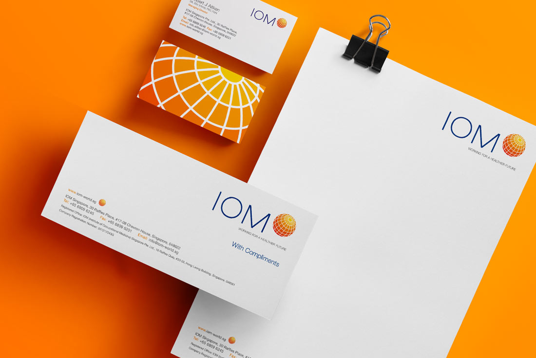
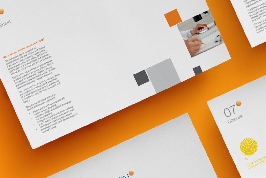
IOM have created a strong brand. However, I have been commissioned to reposition and revitalise their visual identity to picture the company as strong, energetic and current.
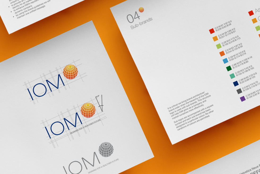
By keeping the symbol of an orange globe, I highlighted IOM’s strong sense of where they come from. Bringing a modern feel to existing elements embrace the future to build an even stronger company, providing the same great service to their clients. IOM are proud of their achievements so far but they are alive with possibilities and open to change – vibrant, energetic and exciting.
The objectives were:
• to communicate more clearly who they are
• ensure the brand identity is highly visible across all media
• provide a single and unified message for all marketing
• bring all sub brands together making sure it stays consistent on every level
• to enhance IOM’s reputation as a dynamic company
• contribute to the long-term brand building exercise, change perceptions and add value
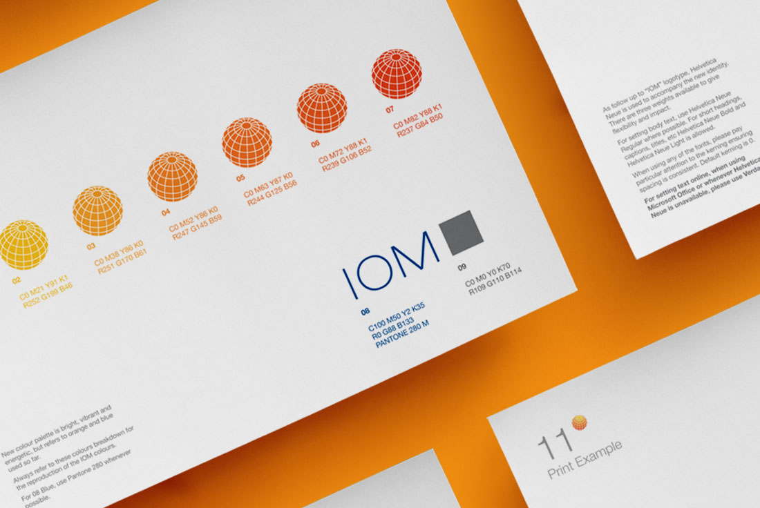
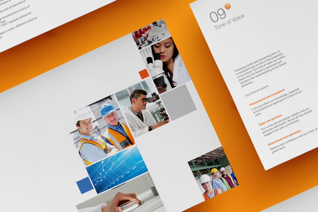
The brand’s value is enhanced by the positive experiences of the clients. This is achieved by the use of brighter colours, professional and competent tone of voice and creativity within design elements.
The new brand is compelling, simple, clear, memorable and reflects IOM’s position as a leading Researcher and provider of Consultancy and Services in Health and Safety.